---
title: "Color Grading Basics for Short-Form Video"
canonical: "https://blitzreels.com/blog/color-grading-basics"
---
# Color Grading Basics for Short-Form Video
URL: https://blitzreels.com/blog/color-grading-basics
Markdown URL: https://blitzreels.com/blog/color-grading-basics.md
Published: 2026-09-04
Author: BlitzReels
Learn color grading basics for short-form video. Covers scopes, LUTs, primary vs secondary correction, beginner workflow, common mistakes, and platform tips.
Tags: color grading basics, video grading, LUTs, scopes, short-form video

The edit is finished. The hook lands, captions are timed, the reframing keeps the speaker centered, and the export looks polished in the editing window. Then the creator drops the TikTok onto a phone and notices the problem immediately: the image looks washed out beside the videos in the feed. The face seems pale, the background has no shape, and the colors feel disconnected from the energy of the cut.
That moment usually isn't a camera failure. It isn't proof that the footage needs another filter. The missing step is a deliberate decision about **exposure, skin tone, contrast, and mood**. Color grading turns a technically assembled edit into an image that feels intentional, especially in [short-form video](https://blitzreels.com/glossary/short-form-video), where viewers make quick visual judgments on small screens.
## Table of Contents
- [The Flat Footage Problem and Why Grading Matters](#the-flat-footage-problem-and-why-grading-matters)
- [What Color Grading Actually Does](#what-color-grading-actually-does)
- [Primary and Secondary Correction Explained](#primary-and-secondary-correction-explained)
- [Primary controls answer global questions](#primary-controls-answer-global-questions)
- [Secondary controls answer local questions](#secondary-controls-answer-local-questions)
- [Scopes That Make Grading Easier](#scopes-that-make-grading-easier)
- [A Practical Short-Form Grading Workflow](#a-practical-short-form-grading-workflow)
- [Start with exposure](#start-with-exposure)
- [Neutralize the light](#neutralize-the-light)
- [Build the primary look](#build-the-primary-look)
- [Apply one LUT modestly](#apply-one-lut-modestly)
- [Protect the face](#protect-the-face)
- [Check the actual viewing condition](#check-the-actual-viewing-condition)
- [Common Grading Mistakes and How to Fix Them](#common-grading-mistakes-and-how-to-fix-them)
- [Stacking LUTs](#stacking-luts)
- [Saturating by eye on a phone](#saturating-by-eye-on-a-phone)
- [Crushing the shadows](#crushing-the-shadows)
- [Putting It All Together With BlitzReels](#putting-it-all-together-with-blitzreels)
- [Quick Answers for New Colorists](#quick-answers-for-new-colorists)
## The Flat Footage Problem and Why Grading Matters
A creator may have recorded a flat, log-style image to preserve highlight and shadow information. Straight from the camera, that footage can look gray, low-contrast, and desaturated. It isn't necessarily bad footage. It hasn't yet been shaped for viewing.
A **neutral balanced look** brings the image back to a believable baseline. Whites appear reasonably neutral, faces don't lean green or magenta, highlights remain controlled, and the shot sits comfortably beside neighboring clips. This is the correction stage, and it gives the audience a stable image to look at.
A **grade with intent** goes further. A creator might keep the face natural while making the background cooler, soften contrast for a personal story, or add a restrained vintage character to a product clip. The grade should support what the speaker is saying and what the brand wants viewers to feel, not compete with the hook.
> **Practical rule:** If viewers notice the color treatment before they understand the message, the grade is probably doing too much.
Color grading has always involved controlled exposure and color decisions. Early photochemical timing was limited to red, green, and blue channels, and a mid-1960s workflow used a Hazeltine Color Analyzer with printer settings measured in printer points, also called lights. The historical relationship between **eight printer points and approximately one stop of exposure** shows that grading began as measurable image control, not as a collection of decorative software sliders. [RedShark's history of grading](https://www.redsharknews.com/the-origins-of-grading) documents that foundation.
Modern digital workflows offer far more precise isolation and styling, but the order still matters. The rest of the process follows a short-form timeline: establish a sound base, protect the face, shape the mood, preview on a phone, and make sure the look survives delivery to the feed.
## What Color Grading Actually Does
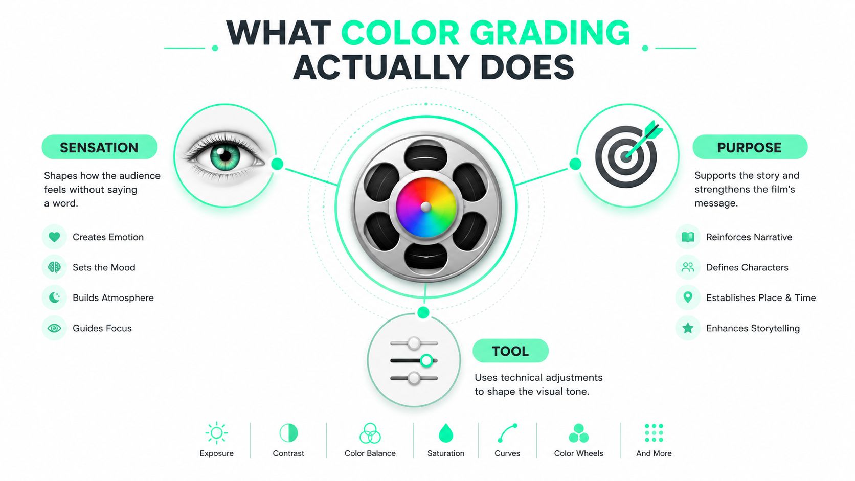
A useful analogy is a wardrobe stylist working with a lighting designer. The stylist chooses the shirt, while the lighting designer decides whether the shirt reads soft, dramatic, warm, or clinical. A colorist works after capture, adjusting how the wardrobe, skin, room, and light are perceived together.
The work has three practical jobs:
1. **Rebalance the image.** Exposure controls the overall lightness of the frame. If the face is too dark, the editor raises the relevant tonal range. If a window is blowing out, highlights need restraint. Contrast separates light areas from dark areas and gives the frame structure.
2. **Control temperature and tint.** Color temperature describes the warm or cool character of light. Tint corrects a green or magenta drift. A neutral wall can reveal a cast that the editor's eye missed while concentrating on the speaker.
3. **Direct attention.** Saturation describes color intensity. Hue identifies the color itself, such as red, blue, or green. A creator might reduce background saturation so a product or face receives more attention without increasing global color.
**Color correction** fixes problems and creates consistency. **Color grading** adds intent after that baseline exists. A LUT, or lookup table, can provide a starting transformation, but it doesn't know whether the person in frame should remain neutral, whether a red shirt is part of the brand, or whether the phone display will exaggerate orange skin.
For editors who need to strengthen the source image before styling it, this [guide to improving video quality for training](https://videolearningai.com/blog/how-to-improve-video-quality) offers useful production context. The same principle applies to social content: a cleaner starting image gives the grade fewer problems to hide.
Dedicated editing platforms, including BlitzReels, surface image adjustments in plain language beside the timeline. That keeps the decision connected to the clip, captions, title cards, and reframing rather than forcing a beginner to hunt through unrelated panels. A restrained [vintage film look](https://blitzreels.com/ai/visual-styles/vintage-film) can work for a brand, but the decision order remains consistent:
- **Skin tone first**
- **Mood second**
- **Trendiness third**
## Primary and Secondary Correction Explained
Primary correction affects the whole frame. Suppose a talking-head clip looks dark, slightly green, and weak in color. The editor begins with the global controls, not a face mask.
**Lift** adjusts the lower tonal range, often associated with shadows. **Gamma** changes the midtones, where most faces and clothing sit. **Gain** affects the brighter areas. A **white point** sets the brightest useful reference, while a **black point** establishes how dark the image becomes. Saturation controls overall color intensity, and tint counteracts a green or magenta cast.
The before-and-after goal is easy to describe. Before correction, the face is dim and the white wall looks green. After primary correction, the face has readable brightness, the wall appears more neutral, and the clip can sit beside the next shot without an obvious color jump.
### Primary controls answer global questions
The editor should make the whole image coherent before isolating anything. A small gamma adjustment may help the face while leaving the window under control. Lift can open a jacket that has become muddy, while gain can keep a bright forehead from drawing attention.
### Secondary controls answer local questions
A **secondary correction** changes only a selected part of the image. A **qualifier** selects pixels by properties such as hue, saturation, or brightness. A **mask** defines the visible area where the correction applies. **Isolation** is the practical act of separating a face, sky, or product from the rest of the frame.
For example, a full-frame creative look may push skin toward orange. The editor can use a skin-tone qualifier, soften the mask edges, and reduce saturation only inside that selection. A sky mask can lower cyan intensity without draining color from the subject's clothing. A product selection can preserve the exact impression of a branded package while the surrounding background receives a different treatment.
Some professional systems use **parallel mixer nodes**, which let separate correction branches affect the same image without forcing every adjustment into one linear stack. Beginners don't need to build elaborate node trees immediately, but the idea is valuable: face protection can remain independent from a creative background adjustment.
| Tool / Step | What it adjusts | When to reach for it in short-form video |
|---|---|---|
| Lift | Shadow and black-level behavior | The jacket, hair, or room feels crushed |
| Gamma | Midtones and general face brightness | The speaker is readable but still lacks presence |
| Gain | Highlights and bright tonal areas | Foreheads, windows, or white shirts look too strong |
| White and black point | Brightest and darkest boundaries | The frame feels washed out or overly dense |
| Saturation | Global color intensity | The whole clip feels dull or exaggerated |
| Tint | Green or magenta balance | Neutral surfaces or skin carry an unwanted cast |
| Qualifier | A color or tonal range | One subject, product, or sky needs separate treatment |
| Mask | The area receiving an adjustment | A local correction must stay off the background |
| Parallel mixer nodes | Independent correction branches | Skin protection and creative styling need separate control |
A [LUT explained for beginners](https://blitzreels.com/glossary/lut) can clarify why a preset belongs after the base correction. In short-form work, the secondary pass usually begins with one question: **does the face still look like a face on a phone?**
## Scopes That Make Grading Easier
The eye is useful for judging intention, but it adapts quickly to a cast or an overly dark image. Scopes provide a second opinion. Short-form editors can do a great deal with three: the **waveform**, **vectorscope**, and **histogram**.
The waveform maps brightness vertically. The bottom represents darker values, while the top represents brighter values. It answers, **is anything clipped or crushed?** Highlights should remain below **100 IRE**, skin tones often sit around **60 to 70 IRE**, and shadows should stay above **0 IRE** when detail needs to survive. These values are practical reference points, not a substitute for judging the story or the shot. [This grading fundamentals guidance](https://www.skrrol.ai/blog/color-grading-fundamentals) emphasizes the face-first problem that many beginner workflows overlook.
The vectorscope maps color direction and intensity. It answers, **where do the colors live?** Skin generally tracks along the I line between the center and outer edge. If the trace drifts toward the center, the image is losing saturation. If it pushes too far outward, the skin may look unnaturally vivid.
The histogram shows how tones are distributed across the frame. It answers, **is the image concentrated in the middle?** A heavy midtone cluster can reveal a flat image, especially after a LUT that changed color without creating enough tonal separation.
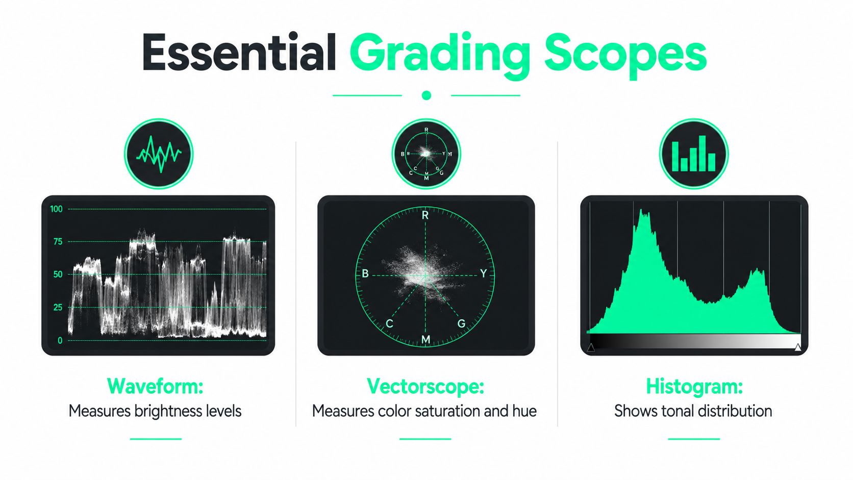
A simple reading habit keeps scopes practical:
- **Waveform:** inspect exposure before touching style.
- **Vectorscope:** inspect skin direction after a creative look.
- **Histogram:** inspect whether the frame has useful tonal spread.
Most NLEs place scopes in a color workspace. An editor can keep the video viewer large enough to judge the face, then use the scope as a warning system. The scope says what may be wrong. The image says whether the correction helps.
## A Practical Short-Form Grading Workflow
A repeatable workflow prevents each upload from becoming a new color experiment. The sequence below suits a talking-head clip, product demo, interview excerpt, or repurposed podcast segment.
### Start with exposure
Place the waveform beside the viewer. Raise or lower the image until highlights peak just under **100 IRE** and shadows sit above **5 IRE** when the shot needs open detail. Then move the midtone control until the face feels clear without making the background compete with the speaker.
### Neutralize the light
Correct white balance before adding creative contrast. A warm cast can feel pleasant in isolation, but contrast can make that cast more forceful. Use a neutral object when one exists, then judge the skin, teeth, and eyes. Mixed lighting may require a local correction rather than a single global solution.
### Build the primary look
Shape contrast with a light touch. A creator might drop contrast slightly for a conversational clip, raise saturation to **110 to 120 percent**, and warm the image by **3 to 5 points** as a starting experiment. These are not universal settings. They're checkpoints that should be revised when the face, wardrobe, or delivery target disagrees.
### Apply one LUT modestly
Put the LUT after the balanced base and reduce its strength to **40 to 60 percent**. Full-strength presets often push skin toward orange or magenta, particularly when the source footage already carries a strong color character. If the look only works at full strength, the preset may be solving the wrong problem.
### Protect the face
Create a skin-tone mask with a qualifier aimed at the I-axis skin line. Soften the selection so the correction doesn't create a visible edge, then reduce saturation inside the mask by **10 to 15 percent** if the face has become too orange. The purpose isn't to flatten the person. It's to keep the creative treatment from becoming the subject.
### Check the actual viewing condition
Preview the grade on a phone under neutral daylight and ordinary indoor lighting. A laptop can hide a cast, while a mobile screen can make dense shadows and strong skin color feel more aggressive. Editors preparing the source material can also consult this [TikTok and Reels filming guide](https://viral.new/blog/short-form-video-production) for capture and delivery considerations.
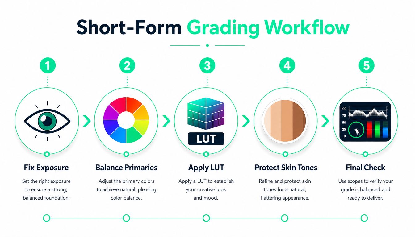
The final export check should happen after captions, reframing, title cards, and any B-roll changes. A vertical crop can place a bright object beside the face, changing what viewers notice even though the grade itself hasn't changed. For Instagram delivery, a creator can also review the practical [video compression workflow](https://blitzreels.com/tools/compress-video-for-instagram-reels) before publishing.
## Common Grading Mistakes and How to Fix Them
More color work doesn't automatically create more polish. On a small social screen, restraint often looks more professional because the viewer can understand the face, product, and text without fighting the treatment.
### Stacking LUTs
A LUT remaps color and tone. Layering a teal-and-orange LUT over a vintage film LUT can produce muddy midtones and lifeless skin because each transformation changes the material the next one receives. The fix is simple: use **one LUT at 40 to 60 percent**, then make manual adjustments above or below it.
### Saturating by eye on a phone
A creator may push global saturation until a frame feels lively, but a face that looked healthy during the adjustment can read as sunburned after social compression. The fix is to reduce saturation within the skin mask and keep global saturation between **105 and 120 percent** as a controlled starting range.
### Crushing the shadows
Deep blacks can suggest drama in a large, carefully monitored image. Mobile OLED displays may make those shadows feel even denser, removing hair, clothing, and room detail. The fix is to raise the black floor so the darkest important pixels sit above **5 IRE**, then confirm the result on the actual phone used for review.
| Mistake | Why It Hurts Short-Form | One-Line Fix |
|---|---|---|
| Stacking multiple LUTs | Midtones become muddy and faces lose life | Choose one LUT and reduce its strength |
| Pushing global saturation | Skin can look overheated and compression makes the problem harder to ignore | Control skin saturation separately |
| Crushing shadows | Mobile viewing hides detail in dark clothing and backgrounds | Lift the black floor and inspect on a phone |
The recurring decision rule is face first, then message, then style. A trend-driven look can serve a brand, but it shouldn't make the presenter look unfamiliar or make captions harder to read against the background.
## Putting It All Together With BlitzReels
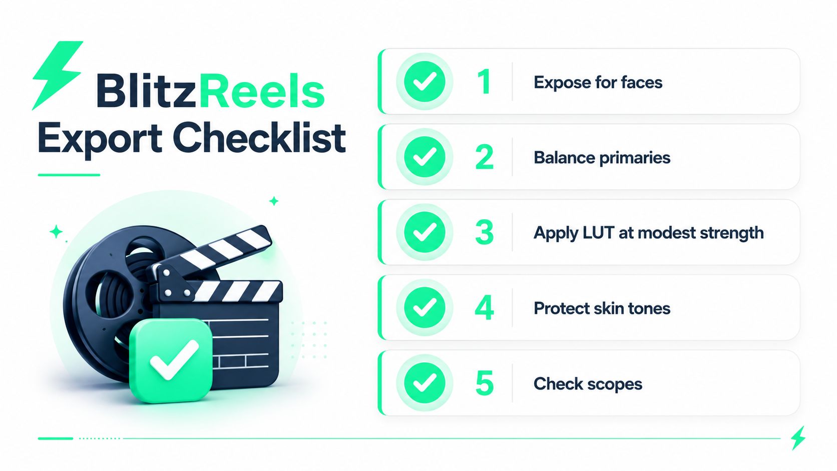
A practical export checklist can fit beside every short-form timeline:
1. **Expose for faces.** Check the waveform and keep the speaker readable.
2. **Balance primaries.** Neutralize exposure and color before styling.
3. **Apply a LUT modestly.** Treat a preset as a starting point, not a finished grade.
4. **Protect skin tones.** Use a secondary mask when the look shifts the face.
5. **Check scopes and the phone preview.** Confirm that the final crop, captions, and colors work together.
BlitzReels can apply a color-grade effect to timeline items, let creators review the result alongside captions and reframing, and support exports for TikTok, Instagram Reels, YouTube Shorts, and LinkedIn. It also brings clipping, transcript editing, caption styling, title cards, templates, resizing, B-roll, and human review into the same short-form workflow. The practical benefit is consistency: a creator can repeat the same face-first checks across a series without treating every edit as a separate grading project.
## Quick Answers for New Colorists
**Does a beginner need monitor calibration hardware?** Not at first. A useful habit is to preview every grade on a phone in daylight and under neutral indoor lighting, then correct any cast that a laptop hides. The next edit should include one phone review before export.
**Should short-form editors choose HDR or SDR?** Delivery depends on the platform and campaign. HDR is gaining traction in commercial and branded content, while hyper-realistic, retro-inspired, and other distinct looks are also appearing across current grading discussions, as described in [2025 color-grading trend coverage](https://www.mcmcreativestudios.com/post/what-s-trending-in-color-grading-for-2025). For a beginner, the safest decision is to match the grade to the intended delivery target rather than assume one universal look. Technical guidance commonly uses Rec.709 D65 for SDR, with SDR mastering at **100 nits** and HDR mastering at **1000 nits**, so the next edit should identify its target before styling.
**Can a creator save a look as a preset?** Yes. Save a reduced-LUT treatment with a consistent group of slider values, name it by mood rather than by a number, and adjust it per clip. A [color-grading glossary](https://blitzreels.com/glossary/color-grading) can help clarify the terms as the preset library grows.
---
BlitzReels gives short-form creators a timeline-based way to apply color grades while clipping, captioning, reframing, resizing, adding title cards, and preparing exports for social platforms. Visit [BlitzReels](https://blitzreels.com) to turn the face-first grading checklist into a repeatable part of the next edit.