---
title: "Screen Recording Editing: 2026 Tips for TikTok & Reels"
canonical: "https://blitzreels.com/blog/screen-recording-editing"
---
# Screen Recording Editing: 2026 Tips for TikTok & Reels
URL: https://blitzreels.com/blog/screen-recording-editing
Markdown URL: https://blitzreels.com/blog/screen-recording-editing.md
Published: 2026-08-17
Author: BlitzReels
Master screen recording editing for TikTok, Reels, and Shorts. Learn practical workflows for trimming, captioning, and exporting vertical videos.
Tags: screen recording editing, short-form video, video editing workflow, vertical video, AI video editing

You've recorded a clean software demo, explained the feature clearly, and opened the file expecting an easy edit. Instead, the result shows a tiny desktop interface inside a wide frame, long pauses between clicks, captions that misread product names, and a hook that arrives after the viewer has already scrolled away. The raw screen capture contains useful information, but it doesn't yet behave like short-form content.
Effective **screen recording editing** turns that raw material into a focused visual story. The editor must decide what the viewer needs to see, when the screen should move, which words deserve emphasis, and how the same recording should fit TikTok, Instagram Reels, YouTube Shorts, LinkedIn, or another feed. The strongest workflow combines structural cutting, vertical reframing, captions, title cards, templates, and a final platform check without allowing effects to bury the demonstration.
## Table of Contents
- [Why Most Screen Recording Edits Fail on Social Media](#why-most-screen-recording-edits-fail-on-social-media)
- [Replace documentation with a visual argument](#replace-documentation-with-a-visual-argument)
- [Build the clip around one promise](#build-the-clip-around-one-promise)
- [The Three-Phase Editing Workflow](#the-three-phase-editing-workflow)
- [Phase one creates the usable story](#phase-one-creates-the-usable-story)
- [Phase two directs the eye](#phase-two-directs-the-eye)
- [Phase three catches expensive mistakes](#phase-three-catches-expensive-mistakes)
- [Transforming Horizontal Recordings into Vertical Gold](#transforming-horizontal-recordings-into-vertical-gold)
- [Choose the crop based on the action](#choose-the-crop-based-on-the-action)
- [Protect the interface from platform controls](#protect-the-interface-from-platform-controls)
- [Captions That Actually Get Read](#captions-that-actually-get-read)
- [Transcript first, styling second](#transcript-first-styling-second)
- [Compare readable restraint with visual noise](#compare-readable-restraint-with-visual-noise)
- [Pacing and Hooks That Stop the Scroll](#pacing-and-hooks-that-stop-the-scroll)
- [Match pace to information density](#match-pace-to-information-density)
- [Export Settings and Final Quality Checks](#export-settings-and-final-quality-checks)
## Why Most Screen Recording Edits Fail on Social Media
The most common mistake is treating a screen recording like a traditional tutorial. The creator leaves the full desktop visible, preserves every click, and assumes viewers will patiently follow the process. That approach documents the action, but short-form video needs to **direct attention toward a result**.
A social edit should answer three questions quickly: what problem is being solved, what changes on screen, and why should the viewer keep watching? The opening can show the finished result, reveal a useful shortcut, or frame the recording around a specific mistake. A title card such as “Stop wasting time on this setting” gives the viewer a reason to stay before the cursor begins moving.
### Replace documentation with a visual argument
A long tutorial might explain every step in sequence. A short clip usually works better when it shows one complete action, removes the setup, and uses a callout to explain the payoff. That means cutting login screens, menu hunting, repeated attempts, and empty pauses unless they create tension or clarify the lesson.
The difference is not just speed. **Short-form video** is built for active, mobile viewing, so the editor must create visual changes even when the source is a static interface. Strategic zooms, cursor emphasis, highlighted buttons, short title cards, and occasional reframing make the screen easier to follow.
Captions matter because viewers may encounter the clip without audio. One industry commentary cites an estimate that **85% of TikTok and Reels viewing happens without sound at some point** ([BlitzCut's vertical video guidance](https://blitzcutai.com/blog/vertical-vs-horizontal-video)). That makes readable on-screen text part of the information design, not decorative polish.
### Build the clip around one promise
A strong edit rarely tries to teach an entire product. It isolates one question, one transformation, or one shortcut. The viewer should understand the promise from the first visual and see the proof before the ending.
> **Practical rule:** If a screen action doesn't support the clip's central promise, cut it, compress it, or move it into another video.
The broader market context reinforces why this repurposing mindset matters. One estimate places the global video editing software market at about **$3.54 billion in 2025**, with a projection of **$3.75 billion in 2026** and **$4.99 billion by 2031**, based on a reported **5.88% CAGR** ([EditBuddy's industry overview](https://editbuddy.app/blog/video-editing-industry-growth-stats-2026)). More creators are building editing workflows around quick demonstrations, tutorials, webinars, and clips rather than publishing unedited desktop captures.
For practical guidance on the format itself, the [short-form video glossary](https://blitzreels.com/glossary/short-form-video) offers useful terminology. The key editorial shift is simple: the recording is raw evidence, while the edit supplies the story.
## The Three-Phase Editing Workflow
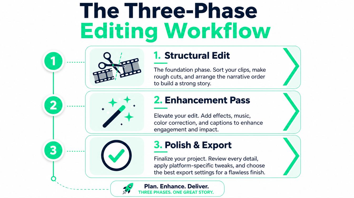
Screen recording editing becomes faster when the editor separates decisions instead of trimming, captioning, reframing, and styling at random. A three-phase workflow keeps structural choices ahead of visual polish, which prevents captions and effects from needing constant rebuilding.
### Phase one creates the usable story
The structural edit starts with the transcript and the timeline. Remove greetings, false starts, dead air, repeated explanations, and navigation that doesn't teach anything. Then identify the strongest opening, the single action that proves the point, and the cleanest ending.
Cut on dialogue when the sentence carries the meaning. Cut on action when the movement itself provides continuity, such as a cursor reaching a button or a panel opening. The important checkpoint is not whether the timeline is visually exciting yet. It's whether the clip can be understood with the effects turned off.
### Phase two directs the eye
The enhancement pass adds visual hierarchy. Zoom into the relevant interface, highlight the control being discussed, and use a callout only when the viewer needs help locating something. A cursor that moves slowly across an empty screen doesn't create emphasis by itself, so the editor should either tighten the movement or replace it with a clearer crop.
This is also the right stage for music, color adjustments, motion graphics, and a restrained template. Captions can begin here if the platform requires early design decisions, but the transcript should already be stable. Editors comparing workflows can also review these [best Instagram video editing apps](https://www.gainsty.com/blog/instagram-video-editing-apps) to understand how different mobile and desktop tools handle effects, cropping, and caption styling.
### Phase three catches expensive mistakes
Polish means checking timing, caption sync, audio continuity, title-card duration, and platform framing. A final pass should inspect the frame immediately before and after each cut. Common problems include a cursor jumping position, a panel appearing without context, or narration describing a control that has already disappeared.
A practical checklist looks like this:
- **Structure:** Does the first visual establish the result or problem?
- **Continuity:** Does each cut preserve the viewer's understanding of the interface?
- **Emphasis:** Is the main action obvious without excessive zooming?
- **Captions:** Do technical terms, acronyms, and product names match the audio?
- **Export:** Does the final file preserve readable text and clean audio on a phone?
A fine-grained captioning benchmark supports this split-review approach. It evaluates **1,000 high-quality videos** with separate spatial and temporal descriptions, making a useful distinction between what appears on screen and when an event occurs ([the benchmark paper](https://aclanthology.org/2025.findings-acl.449.pdf)). Editors should perform the same two checks rather than trusting one overall impression.
## Transforming Horizontal Recordings into Vertical Gold
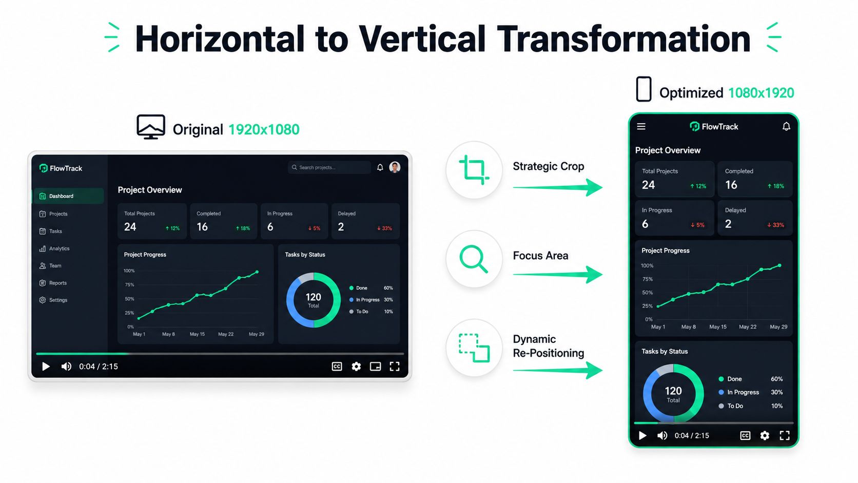
A widescreen desktop capture rarely survives a simple resize. The editor must rebuild the composition around the lesson, deciding which interface area stays visible, which details can disappear, and how the viewer will follow the cursor after the crop.
Short-form platforms generally use a **9:16 vertical canvas**, with **1080 × 1920 pixels** as the standard export size for TikTok, Instagram Reels, and YouTube Shorts ([vertical aspect-ratio guidance from Reezo](https://reezo.ai/blog/aspect-ratios-tiktok-reels-shorts-youtube)). Keep the source horizontal if it preserves context, then reframe the action for a narrow mobile screen rather than shrinking the entire desktop.
### Choose the crop based on the action
Start with the part of the interface that proves the point. A focused crop suits a button, chart, menu, or result. A strong zoom can clarify one interface change, but it hides relationships between panels. If comparison matters, use a split composition, a controlled pan, or a short full-width establishing frame before moving into the detail.
Smart reframing can track cursor movement, though automatic tracking still requires review. The cursor may cross irrelevant areas, move too quickly, or approach the source frame's edge. Keyframed repositioning takes longer to set up, but it keeps the subject stable and leaves a predictable reading area for captions.
> Keep screen movement intentional. Following every cursor twitch makes the crop unstable; refusing to move it makes viewers search for the action.
### Protect the interface from platform controls
Vertical feeds overlay captions, action icons, sound information, and navigation elements. One safe-zone guide recommends placing important material within approximately **Y=220 to Y=1440** of a **1080 × 1920** frame ([Syllaby's safe-zone guidance](https://syllaby.io/blog/aspect-ratios-safe-zones-shorts-reels-tiktok/)). Use that band when positioning button callouts, subtitles, and title cards.
Place the relevant UI state there before adding decorative text. A caption over a low-level control can make an accurate demonstration appear incorrect. A callout behind a platform icon can remove the clip's main lesson. Preview the exported file on a phone, because a full-size monitor does not reproduce the feed's cropping and overlays.
For difficult layouts, [AI tools for vertical video framing](https://blitzreels.com/blog/ai-tools-for-perfect-vertical-video-framing) can assist with automated and manual cropping choices. Review every suggested frame. The crop should follow the viewer's attention and the instructional sequence, not merely mirror the cursor.
## Captions That Actually Get Read
Automatic captions save transcription time, but they don't finish the edit. The editor still needs to correct words, control reading rhythm, choose contrast, and keep text away from interface elements and feed controls.
Independent testing reports caption accuracy in clear English ranging from about **70% to 96%**, with named tools clustering around **85% to 96%** depending on the product ([TechShali's screen-recording software testing](https://techshali.com/best-screen-recording-software/)). That range is good enough to accelerate a first pass, not good enough to publish technical instructions without checking them.
### Transcript first, styling second
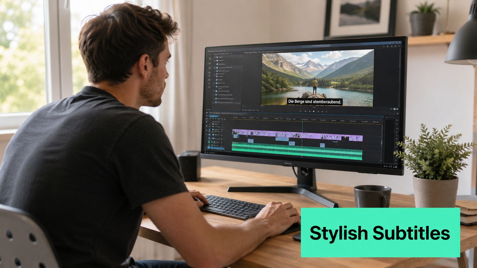
The most efficient sequence is to generate the transcript, correct the words, trim the spoken structure, and then style the captions. Editing text after animated captions have been designed creates unnecessary rework. Technical jargon, acronyms, product names, and navigation labels deserve a targeted verification pass because automated systems often confuse them.
Caption timing should follow natural speech rather than dividing every sentence into identical blocks. Keep each phrase long enough to read, but short enough to track the spoken idea. Word-level highlighting can direct attention to the important term, while a static caption style often feels calmer for dense software instructions.
### Compare readable restraint with visual noise
Bold, high-contrast captions usually perform better editorially than thin text placed over a busy interface because the viewer can identify the words immediately. Emoji callouts can emphasize an outcome or reaction, but using them on every phrase turns the caption layer into distraction.
A useful comparison:
| Caption approach | Strength | Risk |
|---|---|---|
| **Plain subtitles** | Fast and unobtrusive | Important terms can disappear into the interface |
| **Bold highlighted captions** | Strong visual hierarchy and easier scanning | Too much animation can compete with the demo |
| **Word-by-word effects** | Precise emphasis for hooks and punchlines | Technical explanations may feel rushed |
| **Large callout text** | Makes a key result unmistakable | Can cover the very control being demonstrated |
Creators evaluating automated writing and caption support can compare [top caption generator tools](https://rewritebar.com/articles/social-media-caption-generator), but every generated transcript still needs a human review. The [caption engagement guidance for TikTok and Instagram](https://blitzreels.com/blog/how-captions-drive-engagement-on-tiktok-and-instagram) also fits the practical rule: captions must help the viewer understand the action, not merely fill empty space.
## Pacing and Hooks That Stop the Scroll
A screen recording needs a reason to begin. The strongest hook often shows the finished result first, then rewinds to the action that produced it. Other useful openings pose a specific problem, reveal a surprising transformation, or show the exact interface state that frustrates the intended viewer.
The first moments should contain a clear promise, not a logo animation or a long introduction. A title card can establish the problem, while the screen immediately supplies proof. This combination works better than asking viewers to wait for context that could have been delivered visually.
### Match pace to information density
Rapid cuts are useful when the recording contains repetitive navigation, but constant movement weakens comprehension when the viewer needs to inspect a menu or read a result. Hold on a key state long enough to understand it, then cut the surrounding setup aggressively.
Use zooms and reframes to create variety from static material. A short callout graphic can separate two related actions, and a brief piece of B-roll can reset attention between dense explanations. The insert must support the argument, though. Decorative motion that doesn't clarify the product or outcome makes the edit feel like it's compensating for weak structure.
A simple pacing decision tree helps:
- **Show the result first** when the transformation is visually obvious.
- **Start with the problem** when the viewer recognizes the frustration immediately.
- **Use a question** when the answer requires a short demonstration.
- **Hold the frame** when the viewer must read or compare interface details.
- **Cut quickly** when the screen only shows setup or repeated movement.
The format also affects the planning horizon. YouTube Shorts' current guidance allows a maximum length of **3 minutes**, while older summaries still describe a **60-second** threshold, so editors should confirm the current upload rules before building a longer cut ([ANFX's platform guide](https://anfx.co/blog/youtube-shorts-tiktok-reels-video-size-guide/)). A longer allowance doesn't mean every screen recording should run longer. It just gives the editor more room when the demonstration needs it.
Clear audio makes pacing easier to maintain. A clean microphone reduces the need for distracting audio repairs, while an external face camera or an affordable setup can add personality when the creator's presence supports the lesson. For equipment planning, this guide to [affordable vlogging kits for short video](https://digidevice.shop/blogs/updates/best-budget-vlogging-kits-for-tik-tok-and-reels) is a useful starting point.
The [scroll-stopping hook framework](https://blitzreels.com/blog/the-science-of-scroll-stopping-video-hooks) can help creators develop the opening, but the edit still has to deliver the promised result quickly.
## Export Settings and Final Quality Checks
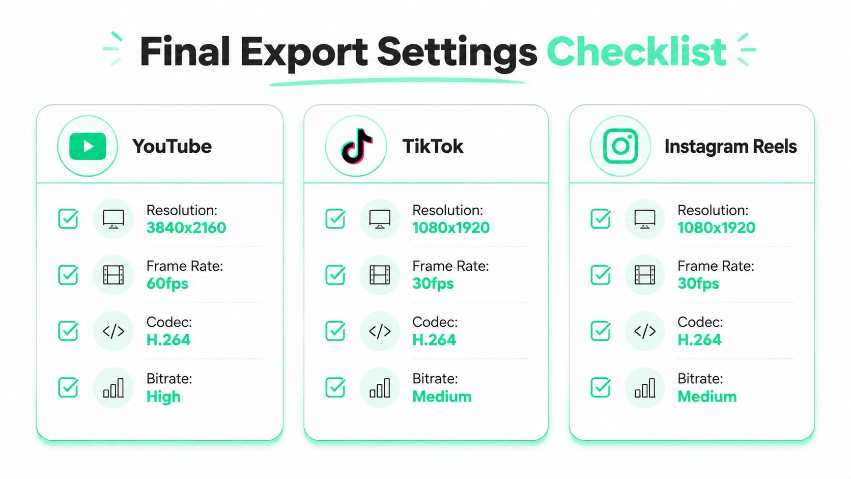
Export settings determine whether a polished screen recording stays sharp after platform processing. For most vertical social clips, choose **1080 × 1920**, **30fps**, and H.264 when the workflow calls for a conventional mobile export. These settings preserve enough detail for captions and interface text without creating an unnecessarily heavy file.
Use **60fps** when smooth cursor movement drives the demonstration and the source was captured at that frame rate. Otherwise, match the source frame rate to avoid needless conversion. A higher bitrate protects small UI text and sharp edges, but it also creates larger files and can increase upload or compression friction. Export a short test when the recording contains dense menus or tiny labels.
Review the final file on a phone, not only on the editing monitor:
- **Readability:** Confirm captions and UI labels remain legible at mobile size.
- **Continuity:** Check the frames around every cut for cursor or interface jumps.
- **Audio:** Verify narration stays synchronized after trimming.
- **Safe zones:** Keep captions, title cards, and callouts clear of feed controls.
- **Opening:** Make sure the hook appears immediately and the first visual earns attention.
- **Compression:** Inspect small text and sharp edges for blocky artifacts.
BlitzReels can import recordings, transcribe them, support transcript-based cuts, generate captions, reframe widescreen footage, and export vertical versions. If the finished file is too large, the [BlitzReels TikTok video compressor](https://blitzreels.com/tools/compress-video-for-tiktok) provides a focused compression workflow.
Upload the recording, refine the cuts and visual emphasis, then visit [BlitzReels](https://blitzreels.com) to prepare a platform-ready vertical edit without rebuilding the workflow from scratch.