---
title: "What Is an Overlay in Short-Form Video?"
canonical: "https://blitzreels.com/blog/what-is-an-overlay"
---
# What Is an Overlay in Short-Form Video?
URL: https://blitzreels.com/blog/what-is-an-overlay
Markdown URL: https://blitzreels.com/blog/what-is-an-overlay.md
Published: 2026-08-11
Author: BlitzReels
What is an overlay in short-form video? Learn main types, why they boost engagement, and how to design overlays that hook viewers.
Tags: video overlay, short-form video, video editing, TikTok captions, BlitzReels

You're mid-scroll, thumb moving fast, and the next clip has about a second to prove it's worth staying for. The face on screen is fine, the lighting is fine, and still the video feels easy to skip until a caption pops in, a title card lands, or a small graphic points attention to the exact point of the story. That layered element is an **overlay**, and in short-form video it's usually the thing that turns a passing glance into a watch.
In plain language, an overlay is content placed **on top of the base video** without replacing it. That can be text, a logo, a sticker, a progress bar, a lower-third, or a picture-in-picture window, and the useful question is never “what can be added,” it's “what earns attention in the first three seconds.” For creators working across TikTok, Instagram Reels, YouTube Shorts, and LinkedIn, overlays aren't decoration, they're the structure that helps a clip hook, clarify, brand, and convert.
## Table of Contents
- [The Three Seconds That Change Everything](#the-three-seconds-that-change-everything)
- [What an Overlay Is](#what-an-overlay-is)
- [Start with the base layer](#start-with-the-base-layer)
- [Don't confuse overlays with other effects](#dont-confuse-overlays-with-other-effects)
- [The Six Overlay Types Short-Form Creators Use Most](#the-six-overlay-types-short-form-creators-use-most)
- [Pick the layer by the job it does](#pick-the-layer-by-the-job-it-does)
- [Keep the list short in your head](#keep-the-list-short-in-your-head)
- [Why Overlays Matter for Short-Form Performance](#why-overlays-matter-for-short-form-performance)
- [Each overlay changes viewer behavior](#each-overlay-changes-viewer-behavior)
- [Placement Rules That Separate Clean Overlays From Clutter](#placement-rules-that-separate-clean-overlays-from-clutter)
- [Put the important layer where the thumb won't miss it](#put-the-important-layer-where-the-thumb-wont-miss-it)
- [Use safe zones, not guesses](#use-safe-zones-not-guesses)
- [Accessibility and Performance Tradeoffs to Plan For](#accessibility-and-performance-tradeoffs-to-plan-for)
- [Readability comes before style](#readability-comes-before-style)
- [Export quality can expose bad decisions](#export-quality-can-expose-bad-decisions)
- [Building Overlays Fast With BlitzReels](#building-overlays-fast-with-blitzreels)
- [A practical sequence that fits a busy posting cycle](#a-practical-sequence-that-fits-a-busy-posting-cycle)
- [Pulling It Together for Your Next Clip](#pulling-it-together-for-your-next-clip)
## The Three Seconds That Change Everything
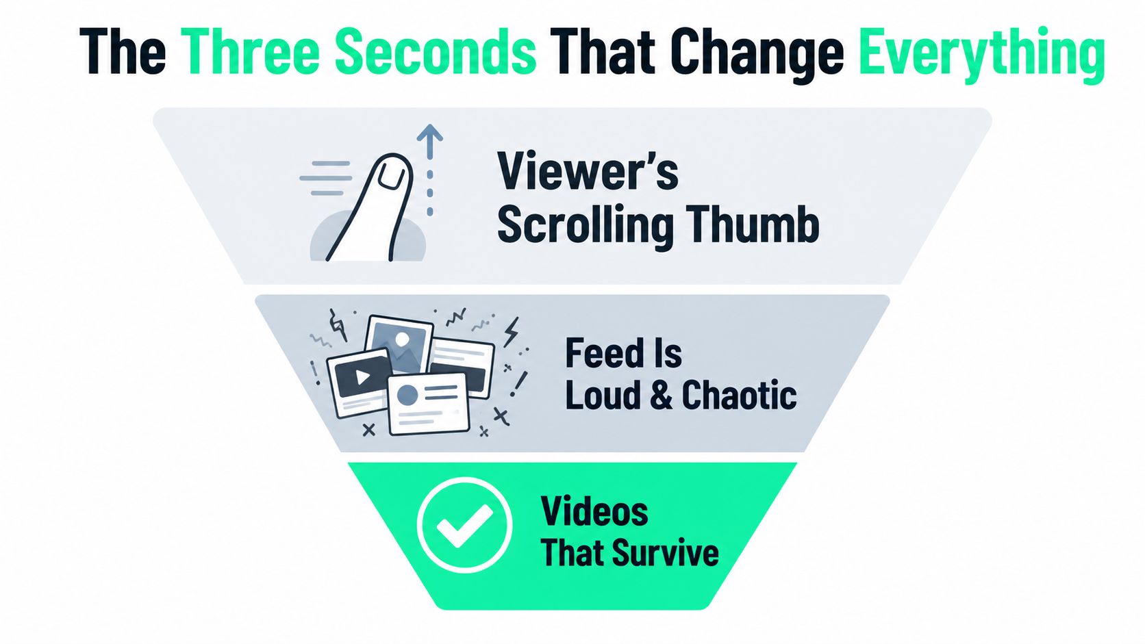
A viewer is halfway through a scroll, not looking for a new favorite creator. The feed is busy, the audio is probably off, and a clip has to earn attention before the thumb moves again. In that moment, the overlay is often the first thing that tells the brain, “stay, this is readable, relevant, and moving somewhere.”
That's why overlays matter so much in short-form. A clean caption, a bold title card, or a tiny progress cue can do what the raw footage can't, it can **frame the story instantly**. The right overlay doesn't compete with the video, it gives the viewer a reason to decode it.
> **Practical rule:** if a clip needs the viewer to guess what matters, the overlay is already late.
For a creator, the useful definition is simple. An overlay is any layer that sits on top of the base clip and changes how the viewer receives it, without changing the underlying footage itself. In a short, that might be a hook line at the start, a branded lower-third, or a CTA overlay near the end, and each one is doing a different job inside the same timeline. A useful reference for short-form structure is this glossary on [short-form video](https://code-reels.com/glossary/short-form-video), which helps place overlays inside the wider edit instead of treating them like add-ons.
The mistake many beginners make is treating overlays like polish applied after the story is done. In practice, overlays help decide whether the story gets seen at all. A polished short often survives the scroll because the first layer on top of the footage answers the viewer's fastest question, “What is this, and why should I care?”
## What an Overlay Is
An overlay is a **stacked layer** placed on top of a base video. The clip underneath stays in place, and extra elements sit above it the way a label sits on a package without changing what is inside. Captions, title cards, badges, frames, logos, and pop-up UI all fit this definition, because they add information or emphasis while the original footage remains visible.
### Start with the base layer
A talking-head shot makes the idea easy to see. The person speaking is the base layer. Add a subtitle line at the bottom, and that subtitle is an overlay. Add a circular picture-in-picture of a screen recording in the corner, and that is another overlay. The video has not been replaced, it has been **augmented**.
That distinction matters because overlays are additive by design. Merriam-Webster defines overlay as “to lay or spread over or across,” and includes a transparent sheet that can be superimposed on another sheet, which matches how short-form editors use the term in practice ([Merriam-Webster](https://www.merriam-webster.com/dictionary/overlay)). The same core idea shows up in interface design too, where an overlay sits above the page content while the original state remains underneath.
An overlay sits above the scene without replacing it.
### Don't confuse overlays with other effects
Beginners often lump overlays, filters, and transitions together. They are not the same. A **filter** changes the look of the footage itself, like color or contrast. A **transition** changes how one clip moves into another. An **overlay** stays on top of the clip and carries extra information, branding, or attention cues.
That mental model helps a creator point at a finished short and label the parts correctly. The face and background are the base. The text, sticker, logo, lower-third, or progress bar is the overlay. Once that is clear, the edit becomes easier to control, because every element on screen has a job rather than just a style.
A **CTA overlay** is a good example of that job-based thinking, since it guides the viewer toward a response without changing the footage itself. For creators who like testing variations quickly, [starryai's AI video features](https://starryai.com/en/blog/ai-video-effects) is a useful comparison point because it shows how AI-driven visual effects can sit alongside more traditional edit layers.
## The Six Overlay Types Short-Form Creators Use Most
| Overlay Type | Primary Job | Watch Out For |
|---|---|---|
| Text overlays | Deliver the hook, caption, CTA, or key explanation | Too much text at once makes the first frame feel crowded |
| Graphic overlays | Add identity through logos, stickers, frames, and badges | Random graphics can look noisy and off-brand |
| Color and gradient overlays | Set mood and improve consistency | Heavy tinting can bury skin tones and reduce clarity |
| Lower-thirds | Identify the speaker, role, or context quickly | Placing them too low can collide with app controls |
| Picture-in-picture | Show a second view, like a screen share or reaction | Tiny video windows can become unreadable on mobile |
| UI overlays | Prompt action with buttons, progress cues, or swipe hints | Fake urgency feels pushy if the design is too loud |
### Pick the layer by the job it does
The fastest way to choose an overlay is to start with the viewer outcome. A **text overlay** should make the message readable at a glance. A **graphic overlay** should make the clip feel owned by a recognizable creator or brand. A **picture-in-picture** overlay should split attention cleanly so the viewer can watch two things without losing the thread.
For creators who like testing variations quickly, [starryai's AI video features](https://starryai.com/en/blog/ai-video-effects) is a useful comparison point because it shows how AI-driven visual effects can sit alongside more traditional overlay choices. The useful question isn't whether a tool can add more layers, it's whether the layer helps the viewer understand the clip faster.
### Keep the list short in your head
- **Captions and title text:** Best when the spoken message has to survive mute playback.
- **Stickers and badges:** Best when the clip needs personality, emphasis, or a quick reaction cue.
- **Lower-thirds and labels:** Best when the viewer needs context about who is speaking or what's on screen.
- **Progress bars and prompts:** Best when the clip needs momentum or a clear next step.
A CTA overlay fits into that last group. A practical breakdown of how to use it sits in [this CTA overlay guide](https://code-reels.com/glossary/cta-overlay), especially for creators who want the final frame to do more than just end.
The rule that separates helpful overlays from random decoration is simple. Every layer should answer one question, and if it doesn't, it's probably clutter.
## Why Overlays Matter for Short-Form Performance
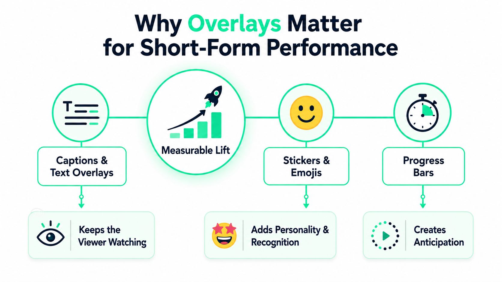
The strongest overlays do one measurable job each. A caption keeps the message alive when the viewer can't hear it, a branded color wash makes the next post feel familiar, and a progress bar gives the eye something to follow while the story unfolds. A short-form clip doesn't need all three at once, but it usually needs at least one of them working hard in the opening seconds.
The sound-off problem is the clearest reason text overlays matter. Approximately **85% of social media video views occur with the sound off**, which makes captions and text overlays the primary vehicle for the message and a critical lever for retention, according to BlitzReels' caption research ([BlitzReels caption data](https://www.blitzreels.com/blog/a-data-driven-guide-to-styling-video-captions)). That's why the best creators don't treat captions as accessibility afterthoughts, they treat them as the main reading track for the clip.
### Each overlay changes viewer behavior
Branding overlays work differently. A logo in the same corner, a consistent font, or a recurring color wash builds recognition over time. The viewer doesn't need to consciously process the brand before the next clip arrives, because the style has already trained the eye.
Picture-in-picture and B-roll overlays do another job, they break visual sameness. A face talking for too long can invite a swipe, but a second visual layer gives the brain a fresh object to track. That doesn't mean every sentence needs a cutaway. It means the edit should change enough to keep the viewer oriented and curious.
UI overlays, such as follow prompts or swipe cues, serve the conversion job. They sit near the end of the clip, where the viewer has already received the point and needs a next action. A good prompt feels like a natural finish. A bad one feels like a billboard dropped into the middle of the story.
For creators trying to connect this to a repeatable workflow, the caption-first approach covered in [this engagement guide](https://code-reels.com/blog/how-captions-drive-engagement-on-tiktok-and-instagram) is a useful reference point. The core idea is simple, each overlay should earn its space by moving the viewer toward watching, recognizing, or acting.
## Placement Rules That Separate Clean Overlays From Clutter
The instinct to fill every empty corner with something usually backfires. A short-form frame is small, mobile screens are even smaller, and overlays start fighting each other the moment they claim the same visual real estate. Clean placement is less about decoration and more about **traffic control**.
### Put the important layer where the thumb won't miss it
The safest rule is to keep the main message in the center vertical third of the frame, where the eye naturally lands first. Captions and UI elements usually belong lower, but not so low that they collide with app controls. Logos and progress cues often work best in the corners, where they can support the clip without stealing the opening beat.
> **Do this:** place one primary overlay near the viewer's first fixation point.
> **Not this:** stack a caption, badge, sticker, and CTA in the same corner and hope the eye sorts it out.
The second rule is hierarchy. One layer should lead, and the others should support it. If the title card is the hook, the lower-third should stay quiet. If the caption is doing the heavy lifting, the graphic overlay should back off.
### Use safe zones, not guesses
A practical way to think about this is the **safe zone**. The center matters most, the lower edge needs padding, and the edges of the frame are where overlays are most likely to get cropped or hidden by platform UI. A short guide to safe-zone thinking is available in [this safe-zone reference](https://code-reels.com/glossary/safe-zone), and it matches what good mobile edits already do by instinct.
The final rule is contrast. Text and graphics need to stay legible against moving footage, which means the background can't be an afterthought. A busy scene behind white text or a bright sticker on a bright clip can turn an otherwise strong idea into visual noise. The cleaner choice is the one that can still be read when the viewer is half-distracted and the feed is still moving.
## Accessibility and Performance Tradeoffs to Plan For
An overlay that looks crisp in the editor and breaks on a phone has failed the job. Short-form viewers don't sit still with a large monitor and perfect lighting, they watch in transit, in low brightness, and often with compression already working against clarity. That's why overlays need to survive the export as well as the timeline.
### Readability comes before style
Text overlays should be sized for vertical mobile playback, not just for a desktop preview. If the text looks elegant but takes effort to read, it's too small. If the styling pushes letters into thin strokes or low contrast, it can disappear against changing backgrounds, especially in fast cuts or face-heavy footage.
Burned-in text and platform-native captions are not the same thing. Burned-in text stays in the video file, which helps preserve custom styling, while platform-native captions can improve accessibility and flexibility depending on where the clip is posted. The better choice depends on whether the creator needs a fixed visual design or a more adaptable delivery path.
### Export quality can expose bad decisions
Overlay-heavy edits can also suffer when a 16:9 source gets reframed into 9:16. A label that was neatly placed in the corner can suddenly sit too close to a crop, and text designed at one resolution can look misaligned after resizing. The safest workflow is to design overlays with cropping, zooming, and recompression in mind, not as an afterthought.
The same principle applies to temporary interface layers. The Digital Bunch notes that overlays often take focus temporarily and can be dismissed without a page change, with modal dialogs, lightboxes, popover menus, and tooltips all serving as standard examples ([The Digital Bunch overlay glossary](https://www.thedigitalbunch.com/glossary/overlay)). That temporary, additive behavior is exactly why mobile overlays need discipline, because they're there to guide attention, not trap it.
A simple pre-export check helps. Read the text on a small screen, verify the safe zones, make sure the branding is consistent, and confirm the overlay still makes sense after resizing. If any of those fail, the clip needs another pass before it goes live.
## Building Overlays Fast With BlitzReels
A modern workflow trims the annoying part out of overlay work. Instead of manually timing every caption, retyping every title card, and nudging every logo by hand, a creator can upload a clip, let the editor transcribe it, and then tune the visuals around the story rather than around the mechanics.
### A practical sequence that fits a busy posting cycle
Start with the source clip, then generate captions that are bold enough to read on a phone. Pick the hook line for the opening title card, since the first frame needs to clarify the promise fast. After that, adjust the color or gradient overlay so the brand look stays consistent from one post to the next.
Then reframe to vertical. Auto-centering matters when the subject moves or when a screen recording needs to sit cleanly inside a 9:16 layout. Lower-thirds, logos, and other presets should follow the face and the safe zone, not get rebuilt from scratch each time.
For creators comparing tools, [platform optimization for viral success](https://auralumeai.com/posts/ai-shorts-maker) is a useful reminder that the best workflow is the one that removes friction before publishing. **BlitzReels** fits that same practical job by handling captions, clipping, resizing, reframing, and overlay placement for short-form exports, while leaving room for human decisions on style and timing. Its [overlay documentation](https://code-reels.com/docs/overlays) is also useful for creators who want to understand how timeline layers are treated inside the editor.
The fastest routine is not fancy. It's upload, caption, hook, brand, reframe, and export. When overlays are built inside that sequence, they stop being isolated design tasks and start working like part of a repeatable short-form system.
## Pulling It Together for Your Next Clip
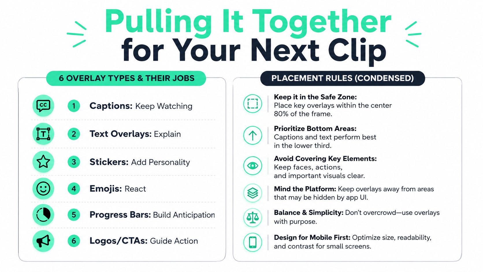
The six overlay types all serve a different job. **Captions and text** keep the message clear, **stickers and emojis** add personality, **progress bars** build anticipation, **lower-thirds** supply context, **picture-in-picture** adds visual variety, and **logos or CTAs** guide action. The placement rule stays the same across them, one layer leads, the others support, and none of them should fight for the same space.
A finished short usually looks simple when the overlays are working. The hook lands early, the caption carries the meaning for muted viewers, the brand mark sits consistently in the frame, and the final CTA appears without breaking the flow. Creators who treat overlays as a system usually get cleaner clips than creators who treat them like decoration.
---
BlitzReels helps creators build that system faster, from captions and title cards to resizing, reframing, and timeline overlays for short-form posts. If the next clip needs to hook faster, read cleaner, and look more consistent across TikTok, Reels, Shorts, or LinkedIn, visit [BlitzReels](https://blitzreels.com) and turn the next edit into a faster publish.